Cutler Cleveland of Boston University has reported that the EROI of oil and gas extraction in the U.S. has decreased from 100:1 in the 1930’s to 30:1 in the 1970’s to roughly 11:1 as of 2000 (Figure 1). But beyond the fact that society receives currently around 11 barrels of oil for every 1 barrel that it spends getting that oil, What does this mean?
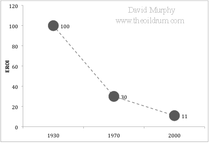
Figure 1. Plot of three estimations of EROI for U.S. oil and gas.
Well, first, it means that, if the trend of declining EROI continues, society will be spending an increasingly larger chunk of their remaining energy to get more energy. This cycle is positively reinforcing:
Declining EROI means that the net energy contained in each unit of energy delivered to society is decreasing over time, requiring the extraction of increasingly greater quantities just to meet societal demand →
decreases the quantity of energy remaining in the ground for future society →
makes it more difficult to find and develop the remaining bit of energy.
With every barrel we pull out of the ground we propel ourselves further down this path, creating a more difficult situation for future generations. (note: I assume that the “Best First Principle” applies to this scenario, i.e. society is using the best resources (i.e. oil fields) first, then the second best, etc…)
More importantly, declining EROI also means that the amount of discretionary energy available to society is FAR less than that predicted by a Hubbert curve (Figure 2). The Hubbert curve represents the total gross quantity of energy available, and, as it is calculated, there are equal quantities of energy available on the left and right side of the peak. This, however, is only true in a gross sense. The net energy available (i.e. discretionary energy) is less. In other words, declining EROI means that there will be much less net energy extracted post-peak than pre-peak on the Hubbert curve.
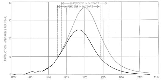
Figure 2. Hubbert curve as published in 1971. See here for a more detailed discussion of M. King Hubbert and this graph.
To understand this in greater depth, I quantified this relationship by first creating a replicate of the Hubbert curve published in 1971 (Figure 2). I then applied the three point values of EROI over the past century (i.e. 1930 = 100:1, 1970 = 30:1, and 2000=11:1), and interpolated linearly the values between the points and into the future to a minimum EROI of 1.1:1. I have no a priori reason to believe that EROI has declined linearly or that it will decline to 1.1 and then level off, but it has certainly declined in the past and as long as it is declining the general results reported here are valid.
I then used the following equation to calculate the percent of net energy available from the gross energy produced:
Figure 3 shows the results of this analysis. Unlike the original Hubbert curve that shows equal quantities of gross energy resources on the left and right side, the Net Hubbert Curve is skewed so that most resources are on the left. For example, according to the original Hubbert curve, 50% of the energy resource is remaining when production levels reach the peak, but this is quite different for the Net Hubbert curve. Due to declining EROI, by the time peak production is reached, 73% of the net energy available is already used.
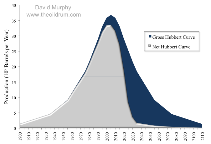
Figure 3. Gross and Net Hubbert curves, adapted from Figure 2.
The implications of these results are vast, but in general, declining EROI is going to make it very difficult to meet the net energy needs of future society. Although this study may not be very precise, it does imply that if we have reached Peak Oil (and I think we have), that society has already spent quite a bit more than half of the net (or discretionary) oil energy that will ever be available.